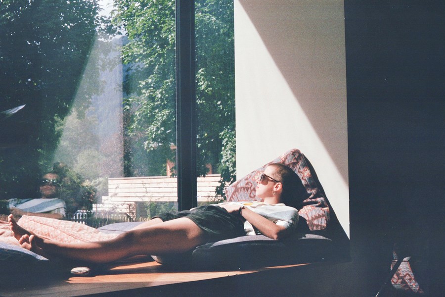
Relaxation 101: Tips for Getting Rid of Excess Stress
You live a busy, demanding life. Your job, the kids, your spouse, and the pets-not to mention your mother-in-law-all take a toll on your physical and emotional well-being. In today's fast-paced world, it's easy to forget to take the time to listen to your body and relax a little. It's time you learn that it's okay to allow yourself to take a break from the daily labors of life. Set aside as few as ten minutes a day where you can relax, renew, and rejuvenate your body and mind. Here are some tips for melting away the stress that you can do every day. Remember, taking time out for yourself doesn't mean you're selfish. Practicing relaxation methods will make you a happier, healthier person. The people in your life will thank you for it!
Just Breathe
It sounds simple. Breathing is as natural a process as they come. But how often do you take time to stop and focus on your breathing? Allow yourself to become centered on the breaths that sustain you. Find a quiet place to sit. Close your eyes. Now take a deep breath. Be sure you are breathing with your diaphragm. Your abdomen should expand as you inhale deeply. Clear your mind as you release your exhale. Focus solely on inhaling and exhaling; don't let your racing thoughts interfere. This is your time just to be.
Aromatherapy and Meditation
Now that you've taken time to breathe a little, further your relaxation with a meditation session. Make sure you have a quiet place away from distractions. Light a stick of your favorite incense. Lavender is known for its calming properties. You might also scent your surroundings by using an essential oil or potpourri. Scented candles offer you a subtle glow to set a relaxing mood along with a pleasing aroma. Now relax.
If your body allows you, try sitting in a lotus position on the floor. You can use contour pillows to prop yourself up a bit if that makes you more comfortable. You can also just sit in a chair if you're not too keen on yoga-style meditation positions. Once you are comfortable, close your eyes and begin to relax. Your goal is to clear your mind. Stop thinking. You might find it easier to reach a higher state of meditation by chanting a word or a sound. This will give you something to focus on and stop any racing thoughts. "Om" is a common sound to chant. Hold the "m" sound as a hum and feel the vibrations in your head. Continue your session for as long as you want. Just be sure you devote at least ten solid minutes to your meditation.
Take a Hot Bath
When was the last time you allowed yourself to soak in a hot bath? After the kids go to bed, fill your tub with hot water and add bubble bath, bath salts, bath oils, or any other type of bath product you like. Make sure to use a product with a calming scent. Lavender, chamomile, vanilla, rosewood, and jasmine are all tremendous natural fragrances that have a calming effect. Light candles and place them around your tub and bathroom. Turn out the lights and bathe by candlelight. The romantic atmosphere is sure to help you unwind.
Massage Therapy
There's no better way to ease the pain of sore muscles than with a massage. Stress build-up often manifests itself in sore, aching muscles. Massage therapy uses touch to help the body heal itself. There are various types of massage to choose from. Some popular practices include Swedish massage therapy, aromatherapy massage, hot stone massage, deep tissue massage, shiatsu, and Thai massage. If you are unsure what type of massage would be best for your over-stressed body, read up on what to expect from each practice. Keep in mind that massages can be quite expensive. A half an hour can run you anywhere from fifty dollars at a small day spa to hundreds of dollars at a private resort. If you can't bring yourself to splurge for a professional massage, get your spouse or a friend to give you a relaxing back, head, or shoulder massage. Any applied pressure to your sore muscles will stimulate them and get more blood flowing. So sit back, relax, and let someone else take care of your aching body.
As you shed your daily stress, you will delight in a newfound lightness of body. Take the time to care for yourself. Find peace in a meditation session, relax in a hot bath, or increase your well being with a massage. Your body will thank you and your mind will be at ease.